

Project | Caruso Rebrand
Categories | Identity System, Print Design, UI/UX, Multidisciplinary
Media | Adobe Creative Suites, Vinyl Printing, Tote Bag, Inkjet Printing
Mentor | Fiona Blankenship
Term | Summer 2018

Overview
This is a project about developing an identity for Caruso, formerly Caruso Affiliated Holdings, LLC. It's one of the largest, privately held real estate companies in the United States, which was founded by Rick J. Caruso in 1987. Its portfolio includes shopping, entertainment, and residential developments in southern California.
Keeping brand identity's antique yet not outdated feature, and striking the right balance between developing luxury products for high salary class and still making it approachable for average consumers are the two main challenges.

Brand Traits
OPEN
Open-minded, Welcoming, Approachable
URBAN
Stylish, Modern, Delightful, Experience
CHARMING
Quaint, Vintage, Timeless, Elegant
LUXURIOUS
Entertaining, Pleasant, Enjoyable, Leisure
Logo

Graphic Elements

Primary & Secondary Colors
The seven colors in the Caruso palette have been chosen for their vintage, elegant, timeless quality. They’re neutral, welcoming colors that support Caruso's vision to imagine, craft and steward a timeless collection of places people love.
Typography & Pattern
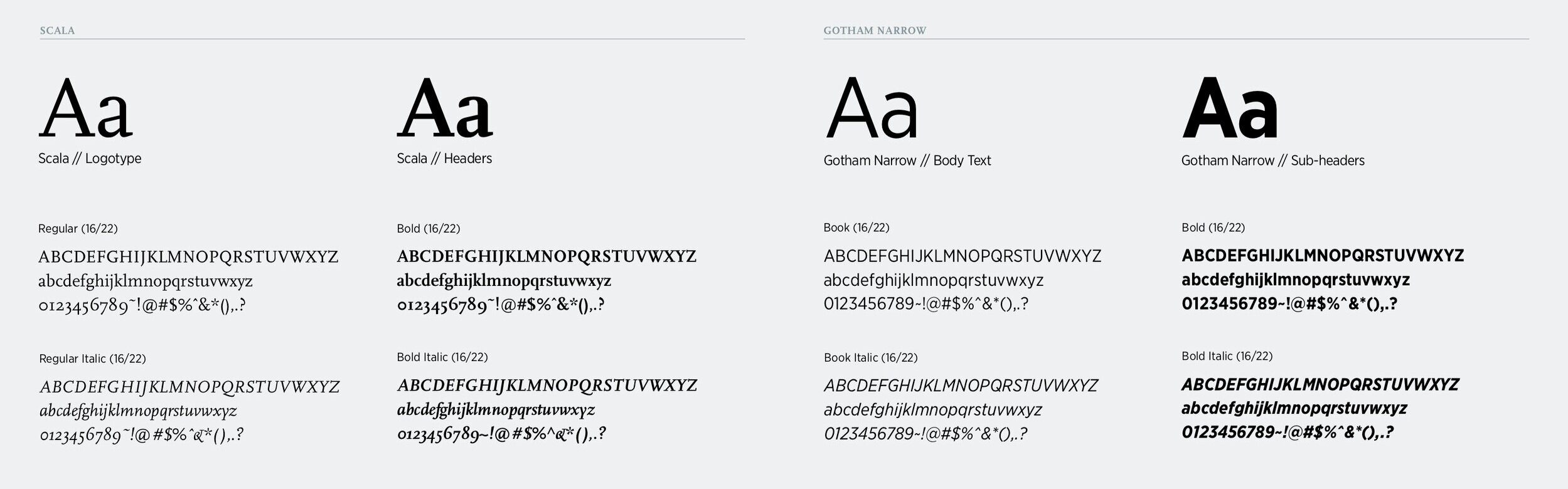
The curves and strokes of the classic serif font Scala were utilized to form the pattern for all the design deliverables.

Applications
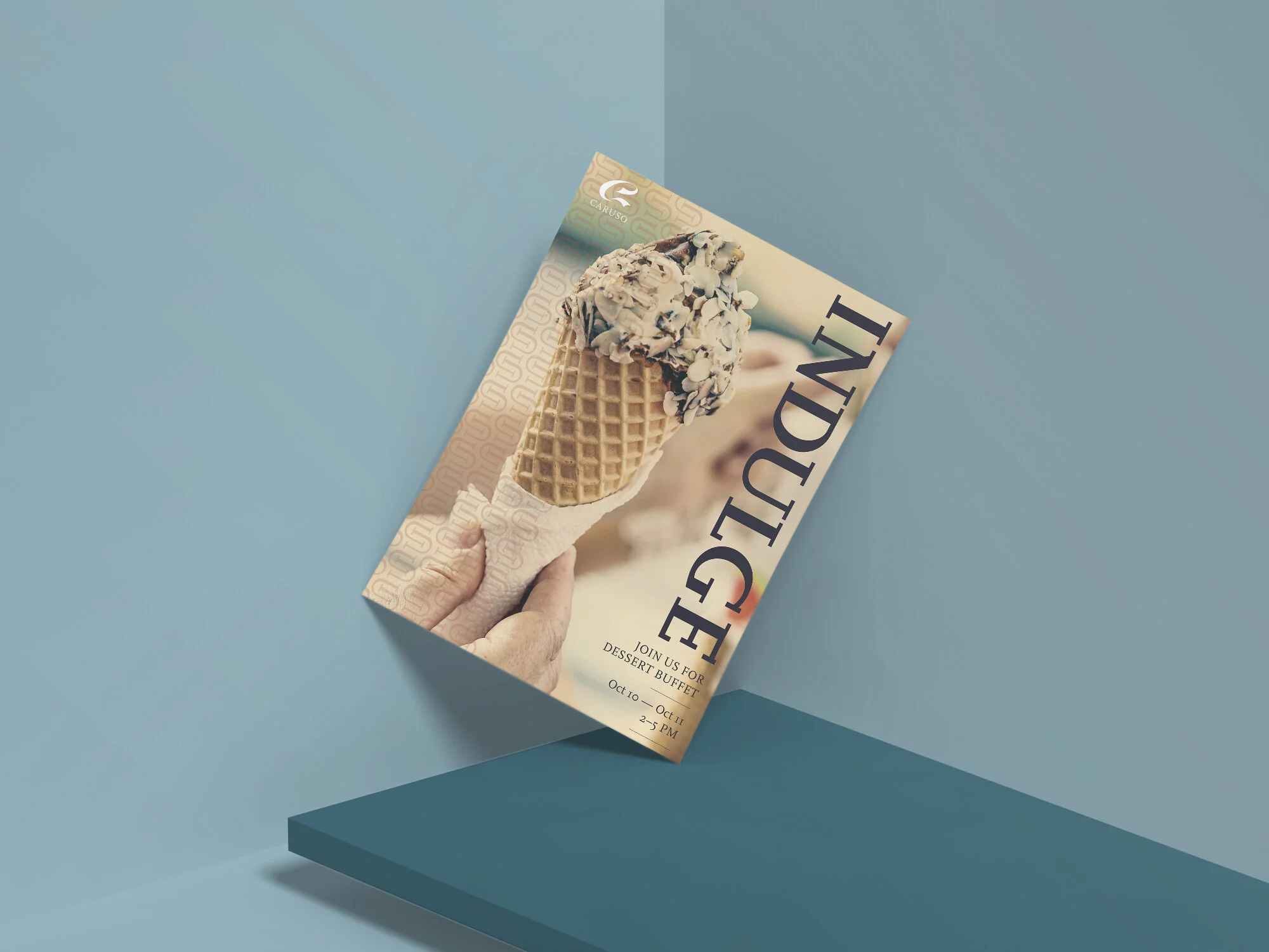
Event Posters
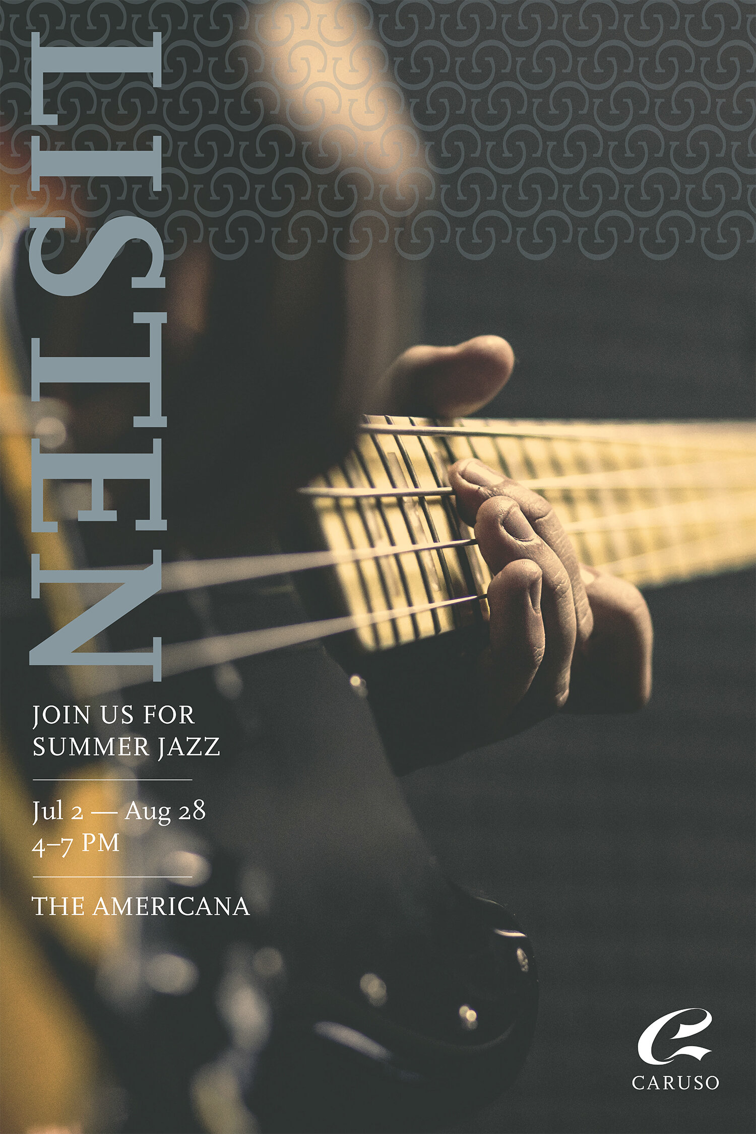


Flyer & Billboard Mockups

Stationery

Shopping Bag

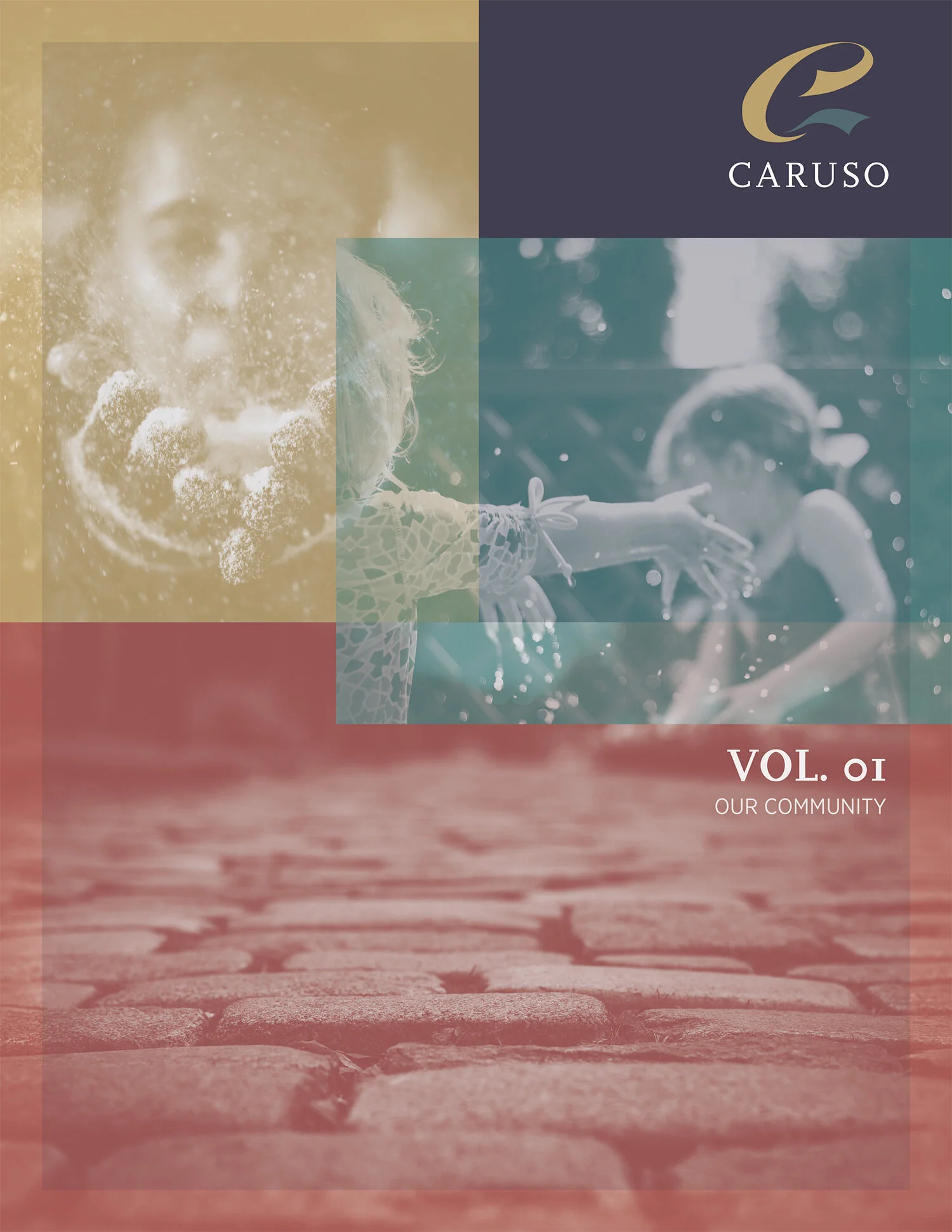
Magazine
Front & Back Cover

Content Pages


Magazine Mockup


Banners & Signage


User Interface
Mobile App


