Project | CrunchyRoll Rebrand
Categories | Identity System, Motion Graphics, Print Design, Video Editing
Media | Adobe Creative Suites, Inkjet Printing
Mentor | Ming Tai
Term | Summer 2019

Intro
Mainly targeted to the younger generation who is interested in ACG (Anime, Comics & Manga) culture in north America, CrunchyRoll is an American distributor, publisher, licensing company and streaming platform that provides entertaining resources including Asian anime, manga, drama, game and live-action shows.
Concept
In order to rebrand CrunchyRoll’s current identity that’s not related to the company’s name enough, my goal was to embrace the food reference and Japanese dining culture regarding their name more in a delightful, playful and engaging style and manner.

Goal
My target audience would be CrunchyRoll’s current customer base that is obsessed with ACG subculture, as well as the potential users who would like to get more customized contents based on their appetites for favorite shows in different categories, to have better user experience with a more friendly and organized app/website’s UI design, and to get more engaged with its fandom communities.
Logo
Overview
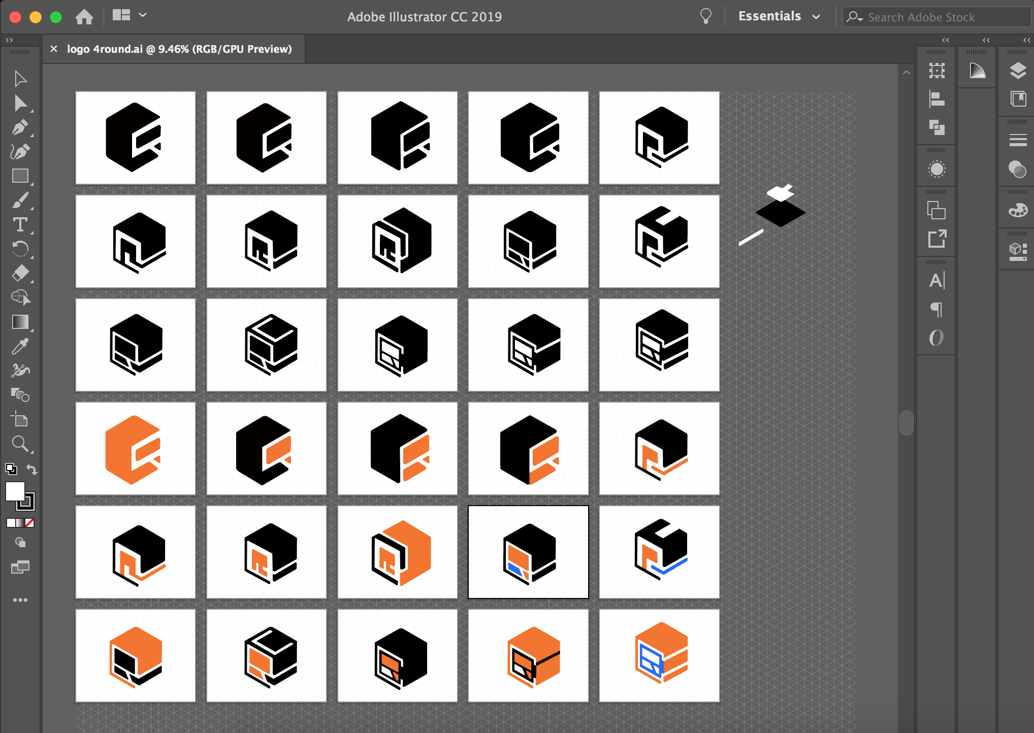
This logo is an isometric rounded-edge cube, which has the shape of an abstract sushi roll with seaweed wrapped from the left side and salmon cubes on the right. The seaweed wrap is formed in a letter C shape, and the negative space between salmon cubes also form the letter R, which together reads as “CR”, AKA CrunchyRoll.
Horizontal & Vertical Lockup
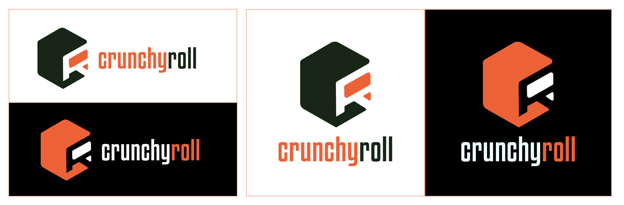
Grid & Clear Space

Credit: VectorStock.com/21677286
Inspired by the isometric illustrations of a variety of sushi rolls, I used isometric grid and hexagon shapes as drivers to build the CrunchyRoll logo.
Graphic Elements
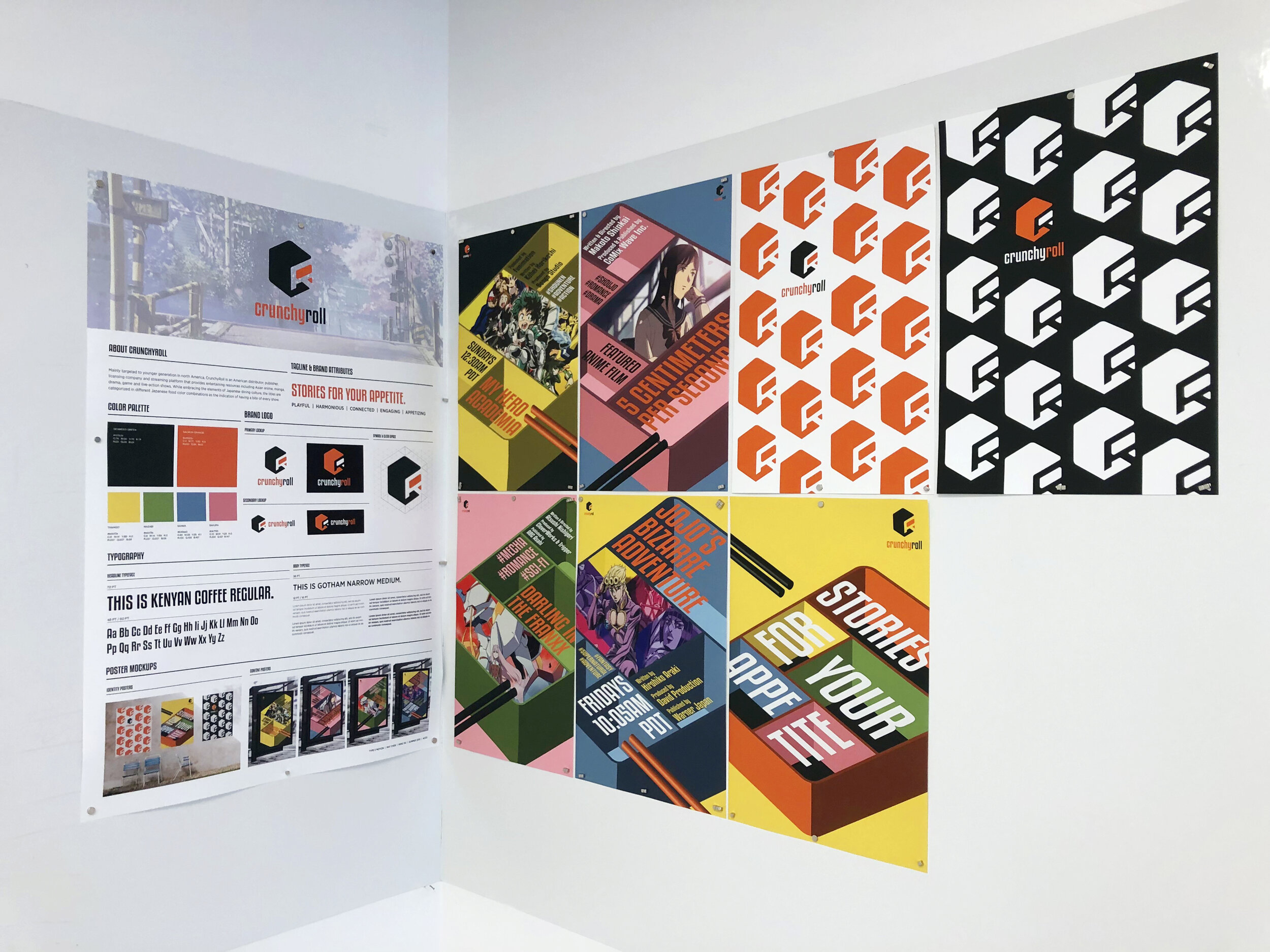
Color Palette
While embracing the elements of Japanese dining culture, the titles are categorized in different Japanese food color combinations as the indication of having a bite of every show.

Typography & Graphic Elements

Kenyan Coffee Regular was chosen as the display typography due to its geometric shape and pop quality, while Gotham Narrow as body font maintains the legibility.

I utilized the shape of the bento boxes as dividers to separate information of each show in the hierarchy.
Lower 3rd
Horizontal & vertical lower 3rd graphics would be applied to CrunchyRoll’s streaming platform teasers and TV commercials.
User Interface
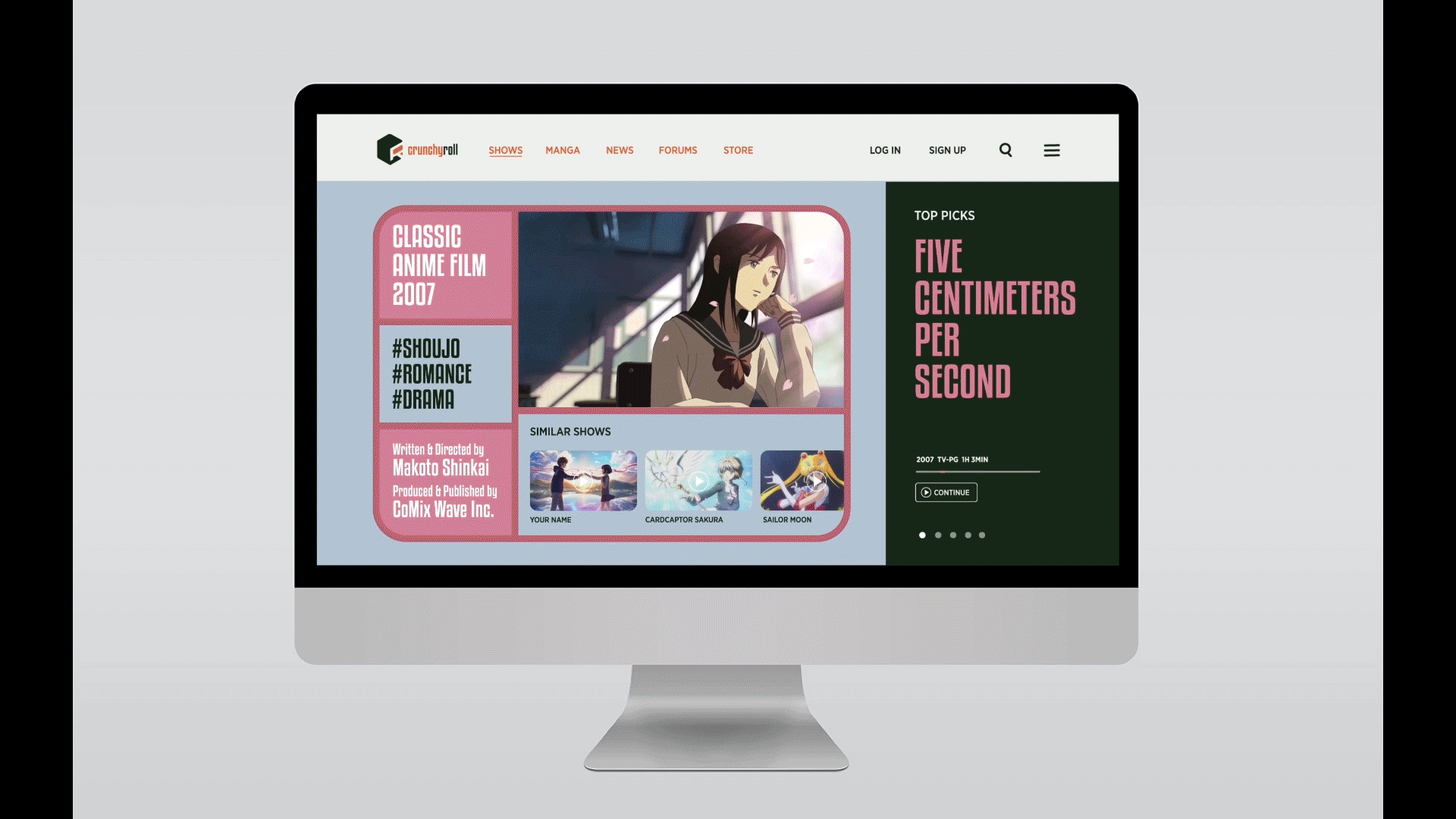
Website Homepage
Here’s a mockup showing how the users could interact with the website UI to select their favorite shows, and how it can shift into the streaming player directly.
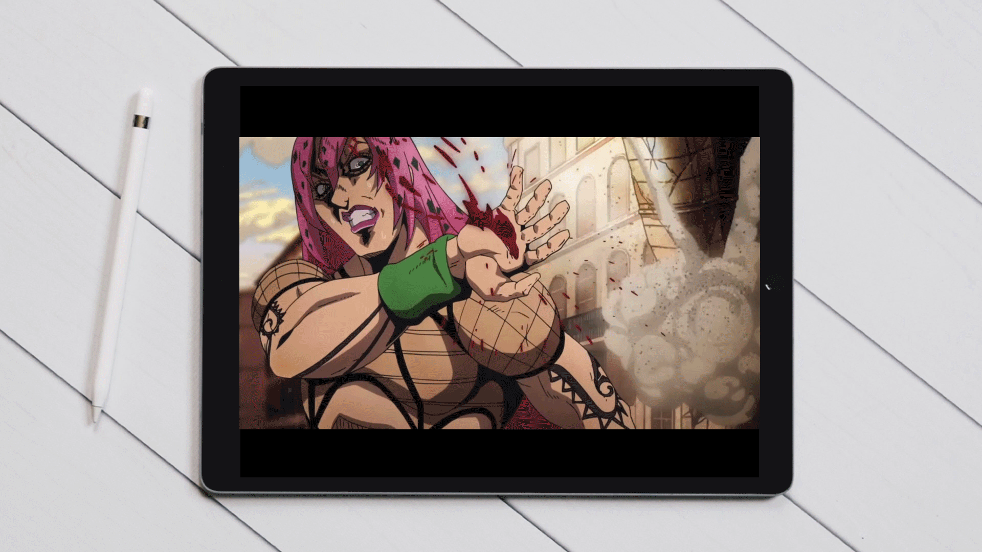
Video Player
The video player button icons were all built based on the geometric hexagon shape and food references.
Posters & Mockups
Identity Posters
An attempt of integrating all elements including the tagline, brand colors as well as the logo. The roll shape in one brand color was utilized as repeating elements to form a wallpaper-like pattern so that only one logo stands out.

Content Posters


With different combination of colors, the shows are categorized into different genres, and the bento boxes are used as modular containers for showcasing the titles’ info in hierarchy.

Billboard
Outdoor billboards play an important role to help us understand how the design could interact with the direct audience within the context in the exhibition environment, and how the scale would affect the overall feel.